Scope
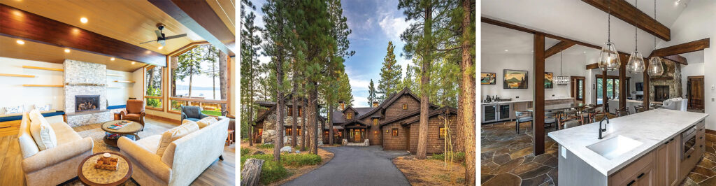
Both Gelso Construction and Liberty Roofing and Painting have been staples in the Tahoe / Truckee area for over 2 generations. They are known for their high quality work, professionalism, and building luxury homes. Each division had a different brand, which created confusion for potential clients. They were also very mindful of the competition who some “perceived” as having more experience or greater capabilities.
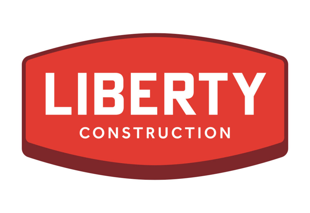
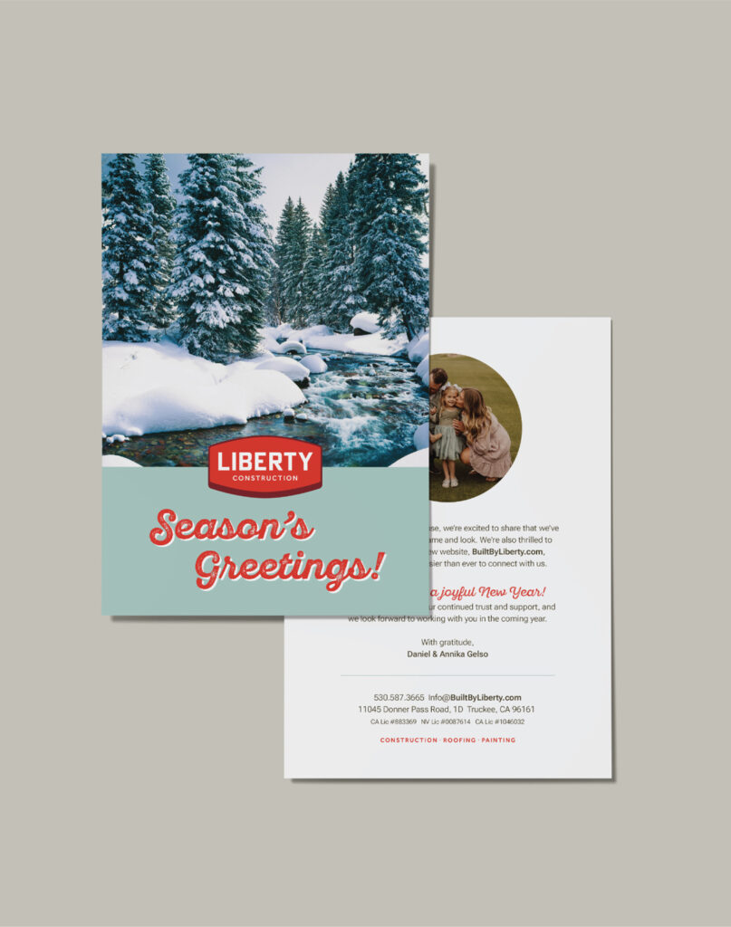
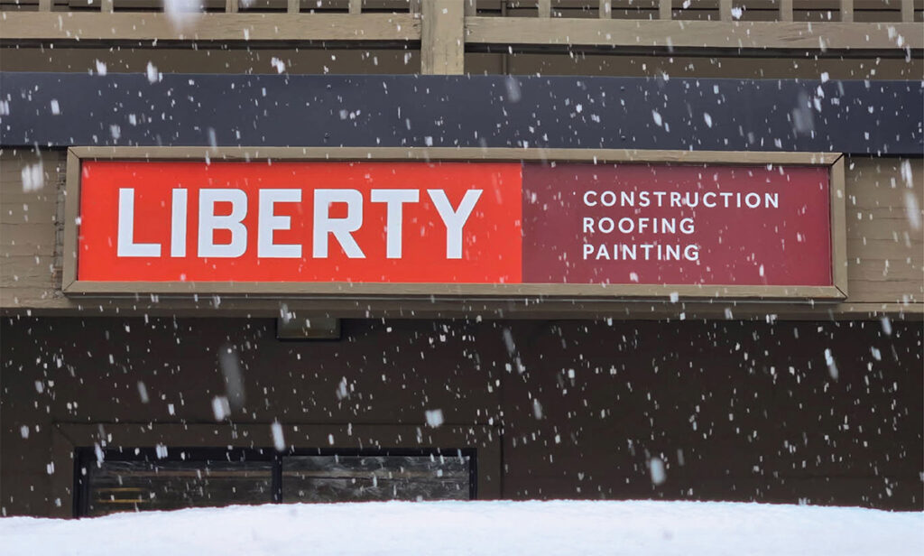
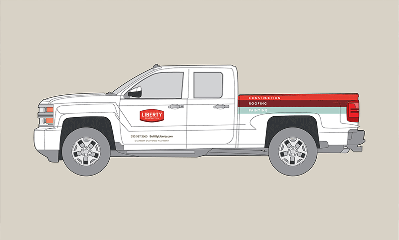
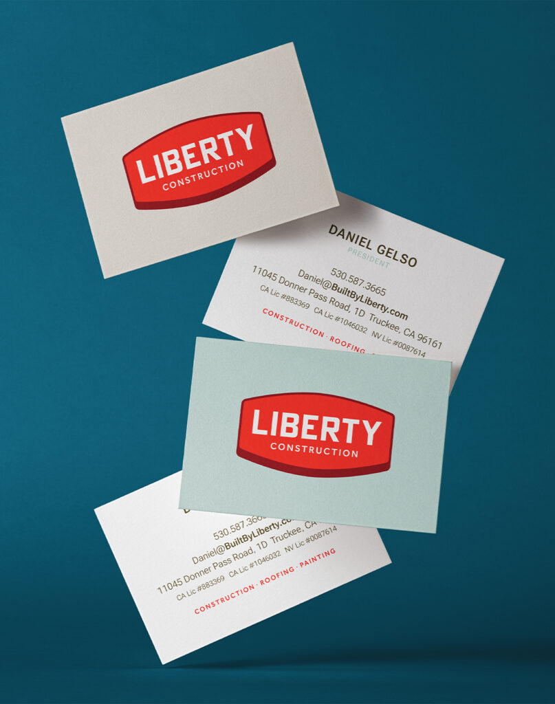
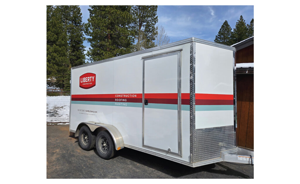
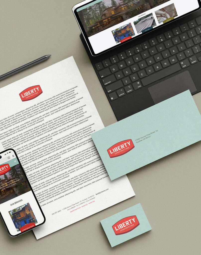
Liberty was looking for a cohesive brand to reflect both their long history as a trusted construction company and their impeccable attention to detail, service skills, and design aesthetics. They also wanted to unify their decades of community involvement under a unified brand. The use of red was intentional to leverage the previous Liberty identity. The shape was inspired by mid-century industrial brands.
Result
Liberty has received very positive feedback on the rebrand, specifically its bold, bright, and very engaging identity. They have received an influx of consultation calls due to the updated website and striking fleet of vehicles throughout the area.